Light / colour temperature
Colour Temperature
The kelvin rating of a bulb is not a technical afterthought — it is an editorial decision about every work on the wall.
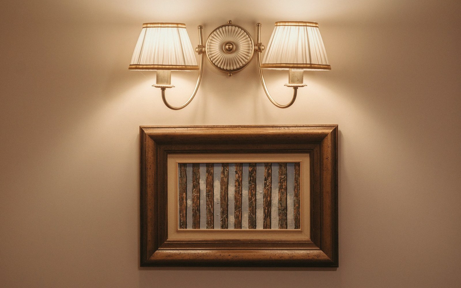
How the number changes the room
Colour temperature is measured in kelvins: lower numbers are warmer (the orange of a candle sits around 1800 K), higher numbers are cooler (overcast daylight runs above 6000 K). The practical range for gallery and domestic hanging falls between roughly 2700 K and 4000 K, and the difference across that band is not subtle.
Warm sources — tungsten incandescents, warm-white LEDs around 2700–3000 K — push yellow and red tones forward and suppress blue. A Venetian painting heavy with ochres and umbers can look magnificent under warm light, the gold grounds appearing to generate their own heat. The same source applied to a painting built on cool blues and greys flattens it, muddying the cold passages and making what should recede seem merely dirty. Warm light does not flatter every palette: it flatters warm palettes, and it lies about everything else.

Cooler sources in the 3500–4000 K range read as more neutral. They are closer to the north-facing daylight that many painters have worked by for centuries, which is one reason that neutral-to-cool sources have become something close to a professional default in institutions with mixed collections. They are less seductive than warm light, but they are less misleading.
The shift to LED has made the choice unavoidable. Incandescent and halogen sources had a fixed, warm colour temperature built into their physics; the only variable was intensity. LED fittings now ship across almost the full visible spectrum, so every installation involves a deliberate selection. That selection tends to get made by a facilities manager against a spec sheet rather than in front of the actual works, which is one of the more consequential mismatches in how rooms currently get lit.
Colour rendering index (CRI) is a related but distinct variable: it measures how faithfully a source reveals the full range of colours in a surface, scored out of 100. A source can be warm and high-CRI, or cool and mediocre. Both numbers matter — temperature for the cast it throws, CRI for what it allows you to see. Serious display lighting generally requires a CRI of 90 or above; anything lower and the source is actively editing the palette of every work in the room.
The practical test is straightforward: bring a work you know well — one whose colour relationships you can hold in memory — and look at it under the proposed source. If the blues have gone grey, if the whites have gone cream, if the reds have intensified at the expense of everything beside them, the temperature is wrong for that work. The kelvin number on the box does not substitute for standing in the room.
Also in Light