The Room / wall tone
Wall Tone
White is recent and not neutral. Every colour a wall carries changes every value in every work hung on it.
In this entry
The myth of neutrality
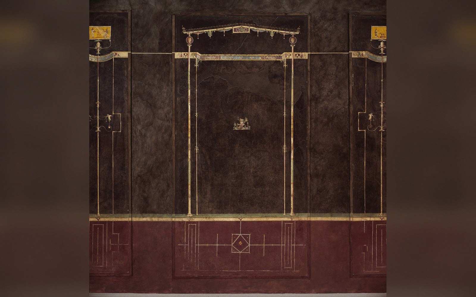
The convention of the white gallery wall is roughly a century old. Before the twentieth century, walls were commonly hung with fabric — crimson damask, deep green baize, flock wallpaper in ochres and golds — and the works were understood against that ground. The shift to white, associated with the modernist ambition to strip the room of period character, was a choice dressed up as the absence of choice. What it actually does is impose a very particular condition: a pale, high-value surround against which every work is read.
Even within white there is no single white. A cool white with blue undertones affects a warm-palette work very differently from a warm white that echoes its ochres back at it. The Kelvin temperature of the light compounds this — a warm lamp on a cool white wall can pull the surface toward neutral, while cool daylight on warm white can pull it toward neutral. The wall is not a passive ground; it is in constant dialogue with the light source and with every surface hanging on it.

What changes when the wall has colour
Hang a mid-toned oil on a deep, saturated wall and something immediate happens to value contrast: darks in the painting read lighter because the wall behind the frame is now darker than they are. The painting's tonal range compresses. Conversely, a pale, high-key watercolour on a dark wall can appear to float with an almost luminous intensity — the wall's depth making the paper seem to emit light. Neither effect is right or wrong in the abstract; both are real, and the hang that ignores them is making uninformed choices.
Colour adjacency matters as much as value. A warm terracotta wall saturates any cool blues and greens in the work — the eye's adaptation mechanism reads the complementary as more intense. A grey wall is often chosen as a compromise precisely because grey has reduced saturation, but the grey's temperature still acts on warm and cool passages in the work. There is no colour that simply leaves a painting alone.
What shifts when tone changes
- Value contrastdark walls compress a painting's tonal range; light walls extend it
- Colour saturationcomplementary wall colours intensify their opposite in the work
- Frame legibilitya gilded frame reads differently against white versus warm or dark grounds
- Small-work scalea strong wall colour can visually overwhelm a small piece
Frame and wall interact the same way. A gilded frame against a white wall reads as warm punctuation against a cold ground; the same frame against an olive or ochre wall either sings in sympathy or disappears. What a frame is doing is never quite separable from what the wall is doing.
Choosing with the works in mind
The practical implication is that wall tone should be selected with the actual works present, not decided in advance on abstract grounds. A large format abstract whose entire logic is built around slight shifts in a near-white field will be destroyed by any wall tone that isn't genuinely close to white. A collection of Old Master drawings in brown and red chalk on toned paper, on the other hand, can be anchored and made legible by a warm mid-tone wall — the ground of the paper and the ground of the wall operating in the same temperature register.
Scale compounds everything. A small work on a large expanse of strongly coloured wall can be overwhelmed; the wall's visual weight becomes a competing element rather than a neutral container. The small work needs a wall that recedes, not one that asserts.
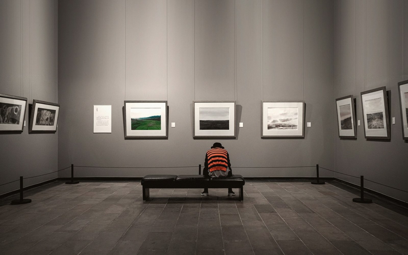
The informed approach treats wall tone as a variable in the same system as light, frame and hanging height — not as decoration applied after the works are placed, but as a decision made in relation to them. A wrong wall colour is a form of interference that no amount of good lighting can fully correct, because it operates at the level of perception itself: it changes what the eye sees before it consciously looks at anything.
Also in The Room