Hanging / the gap
Spacing and rhythm
The gap between works is not empty space. It is an interval — and intervals carry meaning.
In this entry
The gap as an active element
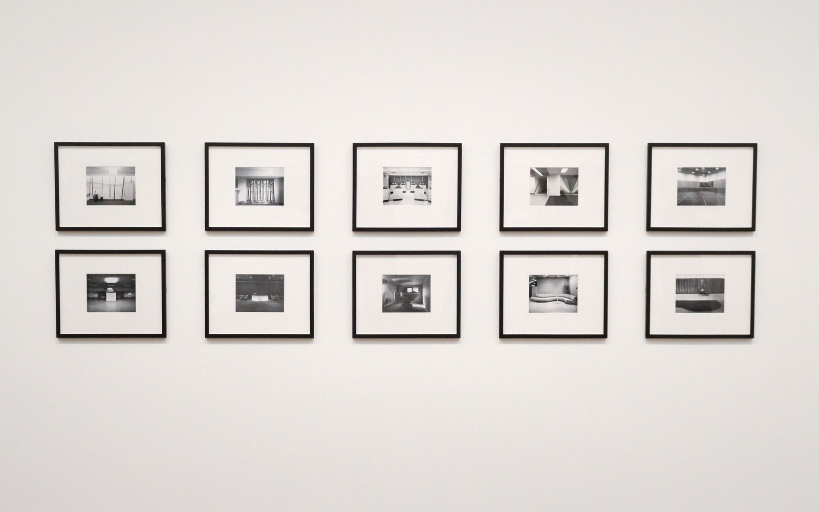
Walk into a room where works are hung too close together and you feel it before you analyse it: each piece reaches into its neighbour's territory, edge-fighting with the next frame rather than completing itself. The eye can't settle. Move to a room where the same works are strung far apart and something different fails — the sequence dissolves into a row of isolated objects, each shouting alone, the argument between them gone. Spacing is the variable that sits between those two failures, and getting it right is not arithmetic.
The principle most technicians start with is a centre-to-centre measurement rather than a gap measurement. Working from the centre of one frame to the centre of the next keeps the eye's travel consistent regardless of whether the works vary in size — which in most real hangs they do. A fixed raw gap between frames sounds logical but produces irregular visual jumps when a small work sits beside a large one: the eye reads the empty wall, not the distance between midpoints. Centre-to-centre thinking redistributes that irregularity into something the eye handles more smoothly.
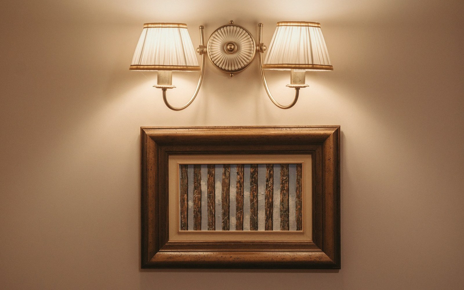
How large that centre-to-centre distance should be depends on the scale of the works and the scale of the room. A domestic hallway of narrow works might run at 600 to 700mm centre-to-centre. A generous gallery with mid-scale paintings might open to 900mm or more. There is no universal number; there is only a ratio between the work's own presence and the breathing room it needs to complete itself. A work with strong colour or heavy impasto needs more air around it. A quiet, small-scale piece hung too loosely in a large white room becomes a smudge on a field — intimacy as a formal property collapses the moment the room overwhelms it.
Rhythm, not regularity
Consistent spacing produces regularity. Regularity is not the same as rhythm. A musical phrase is not just evenly spaced notes; it is the play between expectation and deviation. The same applies on a wall. A hang that places every work at identical intervals becomes a grid, and grids are correct without being interesting. Rhythm enters when spacing is varied with intention: a wider gap before a pivotal work, a tighter cluster where two smaller pieces need to read as a pair, a deliberate breath before the room turns.
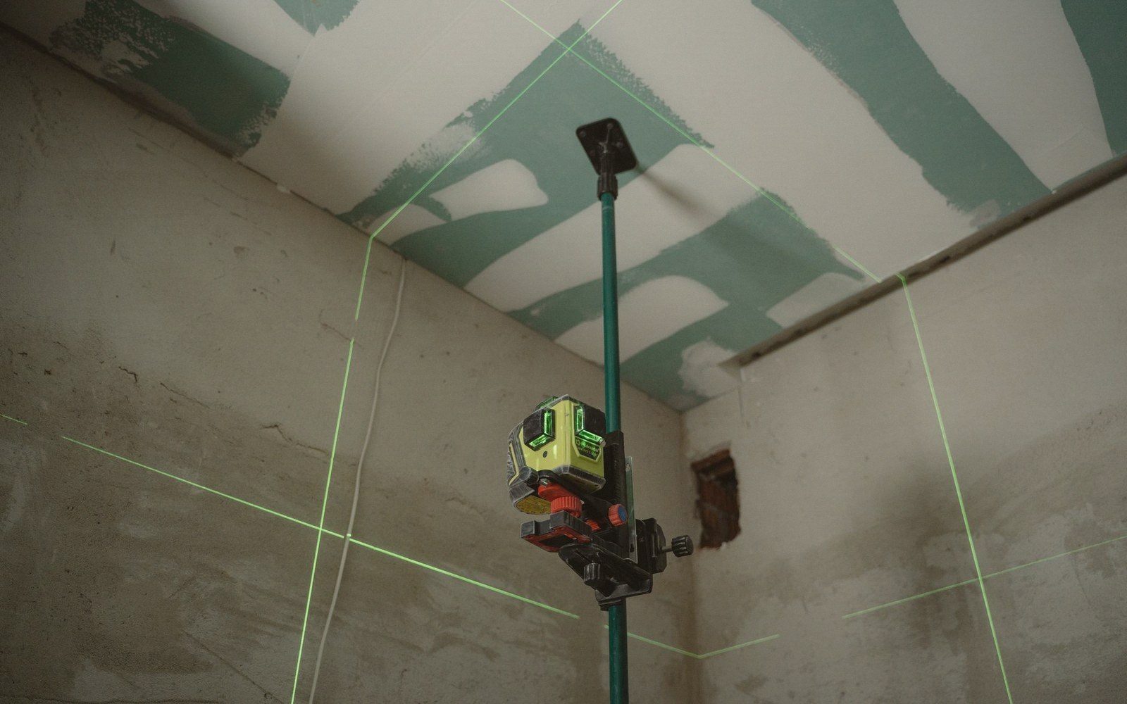
In a sequence of works that forms a visual argument across a wall, spacing does editorial work. Tight intervals suggest continuity, shared logic, pieces that belong in the same breath. A wider gap signals a pause — this is a chapter break. The eye learns these codes quickly and reads them without prompting. That is why careless spacing feels wrong even to viewers who don't know why: they are reading punctuation that has been set arbitrarily.
Where works differ significantly in height, a shared centreline is one way to manage alignment — all pieces sharing the same horizontal axis through their visual centre, which ties the row together even when frame heights vary wildly. The alternative, aligning tops or bottoms of frames, works in certain contexts — a row of identically scaled works, a deliberately architectural hang — but tends to make a mixed group feel sorted rather than composed.
A final practical note that is often skipped: the gap between the lowest work and the floor, and between the top of a work and the ceiling, is spacing too. A work hung with too little wall below it looks dropped, as if it slid down. Too much ceiling above a hung work and the piece floats upward out of human scale. The room itself is part of the composition, top to bottom. Getting the intervals between works right while ignoring the intervals at the margins is like kerning the inside of a word and ignoring the space before and after it.
Also in Hanging